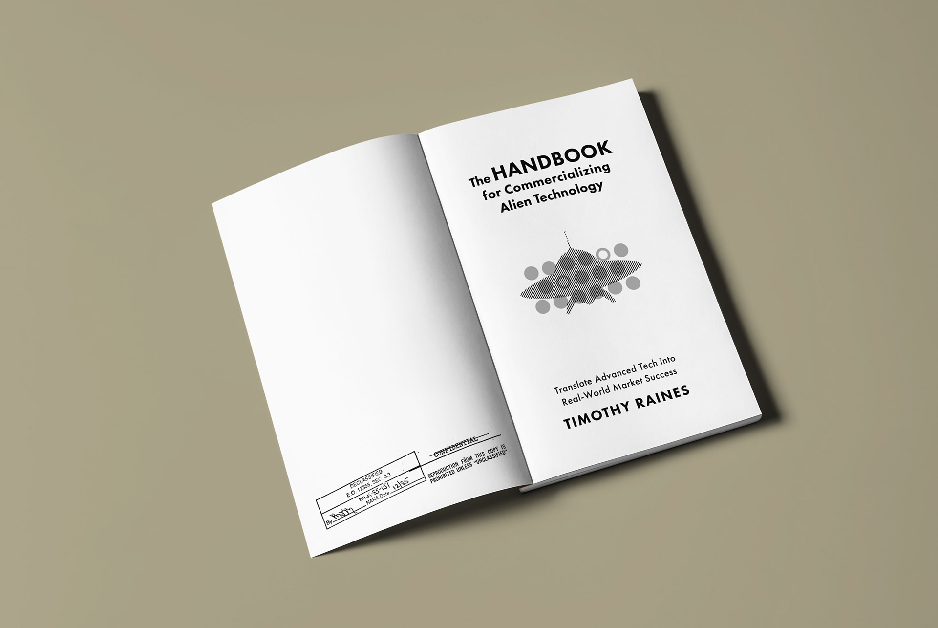
This non-fiction cover channels the authentic atmosphere of 1950s UFO sightings and classified government research facilities. Drawing inspiration from scientific publications of that era, the design captures the paranoid zeitgeist surrounding extraterrestrial encounters and secret military projects.
The design aesthetic emphasises heavy use—smudged surfaces, worn edges, and weathered appearance suggest this is a document that has clearly been consulted by generations of researchers and believers. Throughout the interior, randomly positioned "TOP SECRET" stamps reinforce the clandestine nature of the subject matter.
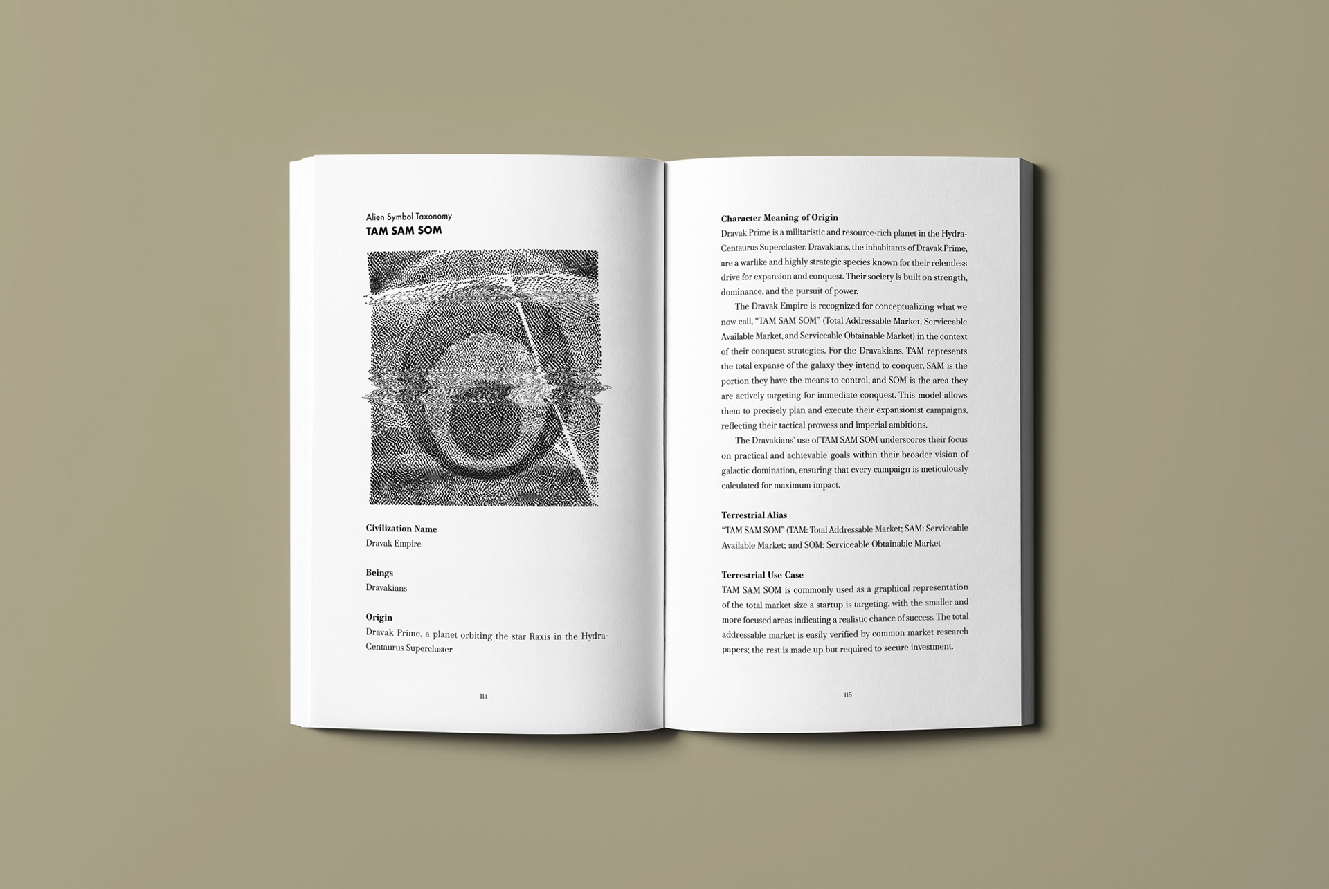
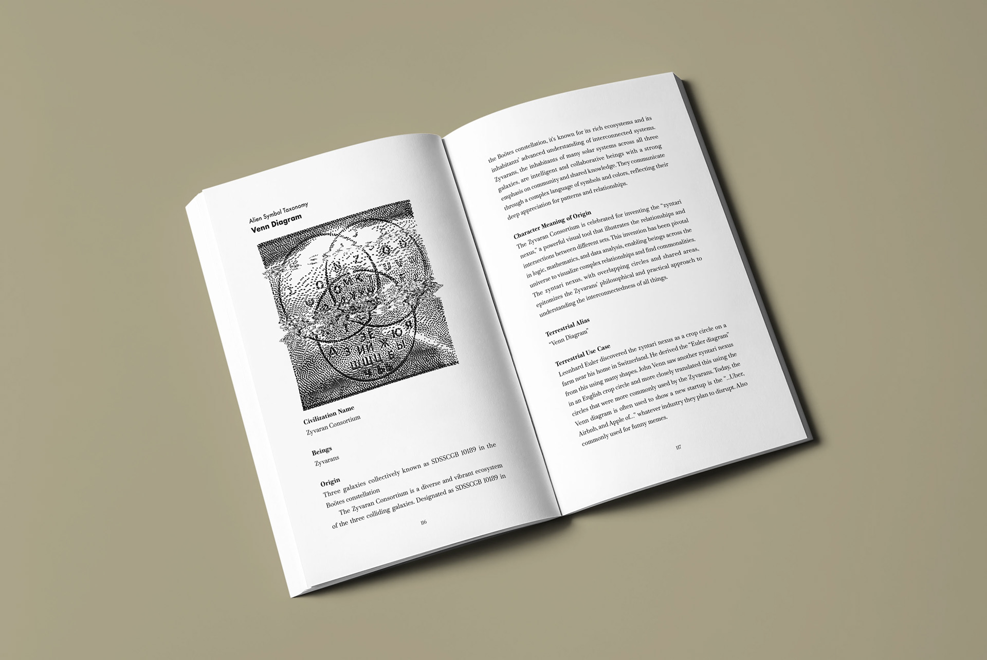
We created deliberately distorted illustrations to feature in the Alien Symbols section, adding to the mysterious and potentially corrupted nature of the alleged evidence. This design approach creates an immersive experience that makes readers feel they're handling genuine classified material from the golden age of UFO paranoia.


We were highly inspired by the wonderful book covers from the 1950s about engineering, mechanics and statistics.


Arjan immediately nailed the cover. I've had a couple of other design students take a pass initially at the cover, but nothing was what I wanted while I'd even told them exactly what I wanted. For Arjan, I decided to give him the general overview and feel I had in mind, but not to tell him exactly what to do. I was blown away by the offerings he made in a short period of time, and how he completely nailed the cover and interior design.
— Timothy Raines